Interactive Dashboard

Web Scraping Price data for Grocery - Liquor – Food

Web Scraping Price data for grocery - liquor – food delivers an advanced, real-time overview of grocery pricing fluctuations across multiple retailers and categories. This grocey price dashboard enables users to monitor price trends, analyze market patterns, and make data- driven purchasing decisions. This sophisticated dashboard provides actionable insights into pricing dynamics across USA, UK, UAE, and India, enhancing strategic decision-making for businesses and optimizing cost management for consumers.

Food-Data-Scrape-Food-Intelligence-For-CPGs
Vertical

Grocery

No. of Categories

12

No. of Sources

5

No. of Products

27835

Food
Grocery
Liquor

Food Category with the Greatest Monthly Price Surge Compared to Averagee

Whole Foods on Gianteagle : %

Avg. Change across all : %

Grocery Category with the Greatest Monthly Price Surge Compared to Average

Bakery and Bread on Kroger: %

Avg. Change across all: %

Liquor Category with the Greatest Monthly Price Surge Compared to Average

BevMo’s Craft Beer on Totalwine: %

Avg. Change across all: %

Monthly Price Fluctuations Analysis

Development-And-Expansion.png

These charts detail the price variations of a $100 grocery basket, with consistent items tracked over a 12-month rolling period. The data is segmented by retailer and category, enabling in-depth analysis of pricing trends. By interacting with the data points, users can observe how prices for each retailer and category have evolved monthly, providing a comprehensive view of month-over-month price shifts.

Average Price Change Across Retailers

Average Price Change Across Categories

Last Month Snapshot

How Should You Interpret This Bubble Plot?

A bubble plot is designed to display the relationships between multiple numeric variables simultaneously. In this chart, each dot represents the price and product availability changes for various grocery categories at a specific retailer over the past month. The size of each bubble illustrates how significant these changes are compared to other retailers within the same category and across different categories at the same retailer. Examining the plot allows you to gauge how price and availability fluctuations vary within and between retailers, providing a comprehensive view of market dynamics.

Pricing-Optimization.png

Average Price Changes

Average Product Availability

Chart Viewing and Data Sources

Charts are best viewed on a desktop or tablet for optimal clarity.

  • Charts 1, 2, 3, and 5: Derived from Food Data Scrape Assortment and Pricing Analytics, these charts present month-over-month average grocery price changes from June 2021 to the present. The data spans 117,381 products across 15 categories and 16 grocery retailers and delivery services, including 7Now, Baker’s, CVS, DoorDash, Drizly, Getir, Giant Eagle, GoPuff, Gorillas, Jokr, Kroger, Meijer, SpartanNash, Walgreens, Walmart Grocery, and Walmart.

  • Chart 4: Also sourced from Food Data Scrape Pricing Analytics, this chart depicts month-over-month average price changes across 15 categories at five major grocery retailers and delivery services, covering the period from June 2021 to the present.

  • Charts 6 & 7: Provided by Food Data Scrape Pricing Analytics, these charts illustrate month-over-month variations in grocery price and availability for the previous month, segmented by category and analyzed across five leading grocery retailers and delivery intermediaries.

Access Advanced Dashboards for Food, Grocery, and Liquor Analytics

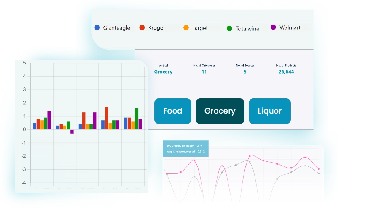
Unlock diverse dashboards for Food, Grocery, and Liquor—gain powerful insights and elevate your analytics for smarter, data-driven decisions.

Price Decrease V/S Category Avg Price Decrease V/S Category Avg Price Decrease V/S Category Avg Retailer Price Trends Bar Chart for Categories Bubble Chart Example Retailer vs. Category Price Change